Today is the 85th anniversary of the inauguration of the Reserve Bank of India. It was about one year back that I decided to start a blog covering issues relating to Indian banking and central banking. A website was created about nine months back. But, the actual work on the started only two days back. The objectives and other details of the blog are in the About page. In this post, which is the first on the site, I explain the title of the blog.
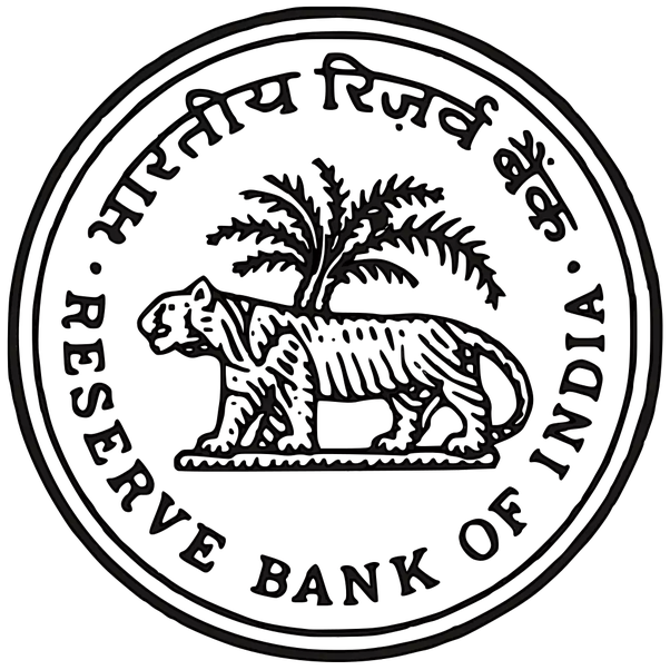
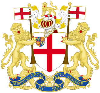
The title is derived from the seal of the Reserve Bank of India, which was in turn adapted from the double mohur coin of the East India Company. Even though the Bank was formally inaugurated only on 1 April 1935, certain provisions relating to the constitution of the Bank, issue of share capital and establishment of Central and Local Boards became operative from 1 January 1935. The Central Board first met on 14 January and again on 23 February of that year. It was in the second meeting that organizational matters including that of a seal for the Bank were discussed and finalised.
The Bank’s official history (Vol. 1, 1970) records in pages 131 and 132 as follows:
“… Special care was taken to choose the sketches for the seal as, at a later stage, it was to be used as the emblem of the Bank on currency notes, cheques and publications. The Government’s general ideas on the seal were as follows:
(1) the seal should emphasise the
Governmental status of the Bank but not too closely;
(2) it should have something Indian in the design;
(3) it should be simple, artistic and heraldically correct; and
(4) the design should be such that it could be used without substantial
alteration for letter heading, etc.”
“For this purpose, various seals, medals and coins were examined. The East India Company Double Mohur, with the sketch of the Lion and Palm Tree, was found most suitable; however, it was decided to replace the lion by the tiger, the latter being regarded as the more characteristic animal of India!”
“To meet the immediate requirements in connection with the stamping of the Bank’s share certificates, the work was entrusted to a Madras firm. The Board, at its meeting on February 23, 1935, approved the design of the seal but desired improvement of the animal’s appearance. Unfortunately it was not possible to make any major changes at. that stage. But the Deputy Governor, Sir James Taylor, did not rest content with this. He took keen interest in getting fresh sketches prepared by the Government of India Mint and the Security Printing Press, Nasik. As a basis for good design, he arranged for a photograph to be taken of the statue of the tiger on the entrance gate at Belvedere, Calcutta. Something or the other went wrong with the sketches so that Sir James, writing in September 1938, was led to remark:
“. . . . . ‘s tree is all right but his tiger looks too like some species of dog, and I am afraid that a design of a dog and a tree would arouse derision among the irreverent . . . . . ‘s tiger is distinctly good but the tree has spoiled it. The stem is too long and the branches too spidery, but I should have thought that by putting a firm line under the feet of his tiger and making his tree stronger and lower we could get quite a good result from his design.”
“Later, with further efforts, it was possible to have better proofs prepared by the Security Printing Press, Nasik. However, it was eventually decided not to make any change in the existing seal of the Bank, and the new sketches came to be used as an emblem for the Bank’s currency notes, letter-heads, cheques and publications issued by the Bank.”
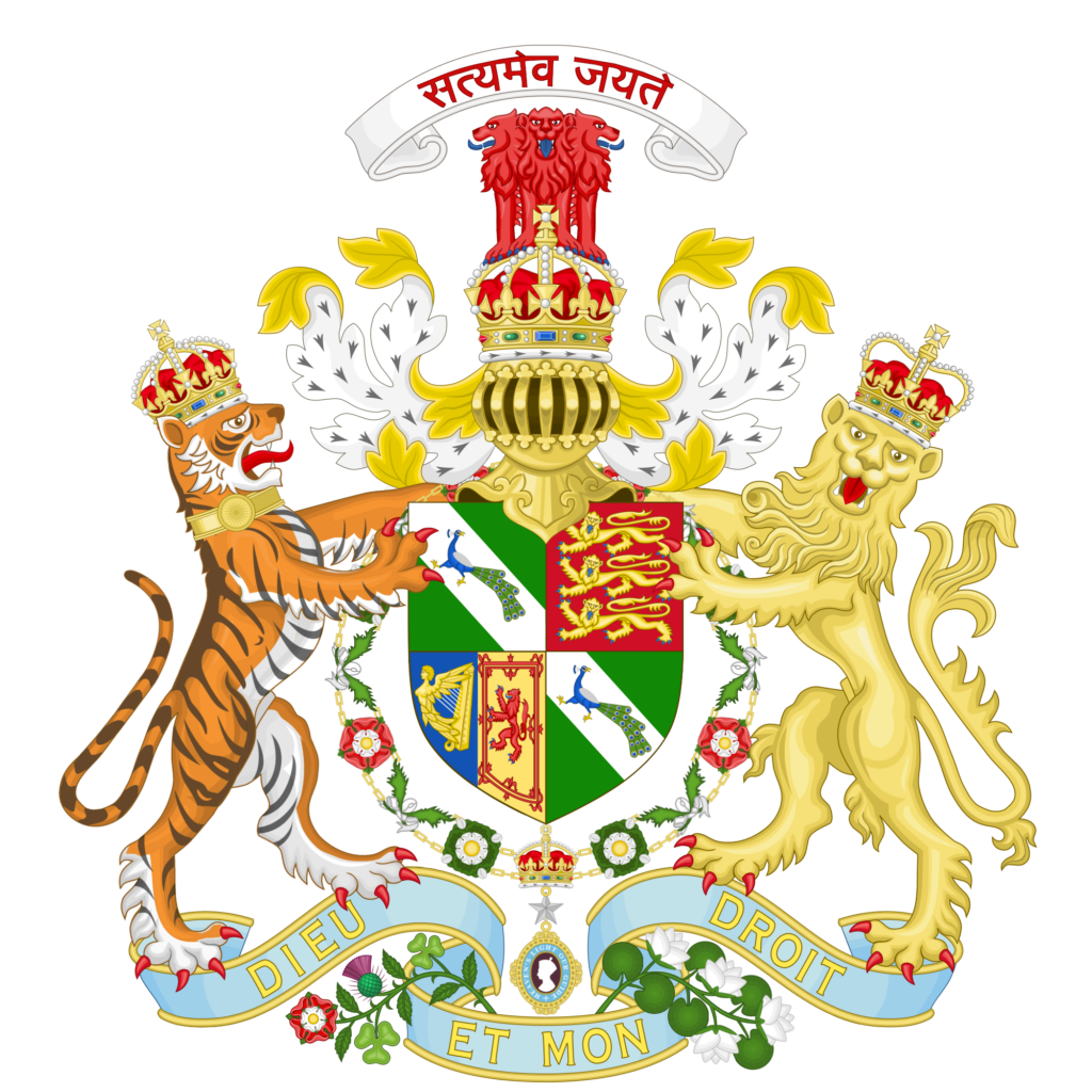
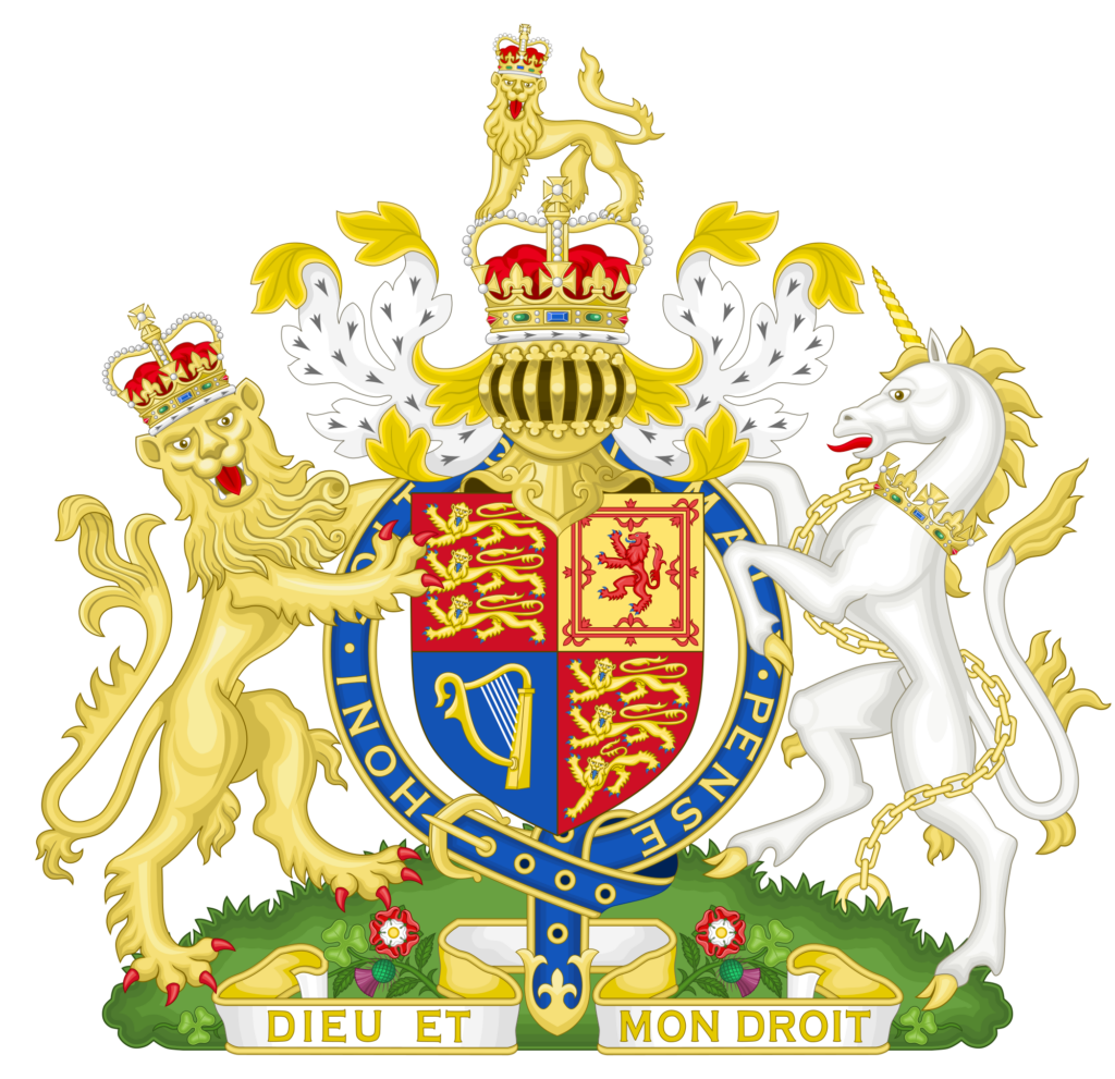
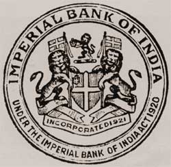
In designing the emblem, the consideration of emphasising governmental status was perhaps achieved by choosing a design that was used by the East India Company for its coin as the base. The argument that the lion was replaced with the tiger as the latter was more representative of India does not seem to me to be entire truth. After all, India was and is still known as much for its Gir lions as it was for the Royal Bengal Tiger. Moreover, the lion was the national animal till 1972, when it was changed to tiger. This coincided with the launch of Project Tiger and the change was made to create greater awareness about the need for protection of tiger. In my view, the change was made to distance the Bank from the Government. The lion, four of them, occupied the pride of place in the Imperial Coat of Arms, even though it also had a tiger and two peacocks, which along with the lotus, Ashoka Pillar and Satyameva Jayate written in Devanagari script were allowances made for the region. The emblem of the Imperial Bank of India also had two lions supporting a shield, generally in the manner of most institutions linked to the British Government where the Royal Coat of Arms has nine lions! In any case, copy the design used by the East India Company in its entirety would perhaps not have been acceptable.
The second condition that the design have something Indian was also met. And it is indeed simple, though I am not sure about being artistic and heraldically correct. For reasons discussed below. And the design is such that it can be used for various other purposes without much alteration.
Who actually designed the new seal is perhaps lost in history. It was probably the handiwork of someone in Madras where one of the original designs were made, someone at the Security Printing Press, Nasik, or someone in Calcutta who had seen the tiger (looking right) on the entrance gate to Belvedere House in Calcutta, till 1911 the residence of the Viceroy of India and later that of the Governor of Bengal. Or, maybe, acting on Taylor’s advice different aspects would have got combined by someone who remains a mystery.
Thus, the argument for a tiger seems to be stronger. While the lions are largely confined to Gujarat, tigers are there all over the subcontinent. Tigers have a better bite force than lions. But, the lions roar and don’t purr. Their roars can be heard up to 8 km as against only about 3 for tigers. Moreover, lions are more social than the tiger which is usually a solitary predator. And, after all, the lion is the “king of the jungle”!

In the process of replacing the lion with the tiger, the aesthetic consonance provided by the fronds of the palm tree leaning upward to the right and the mane of the lion looking down to the left was lost. A search for a picture of a tiger against a palm tree gave me the insight that there are usually no palm trees in habitats where tigers are found!
The legend behind the original design and how the East India Company’s double mohur coin with the design of a lion and palm tree came into being is a different story. I will discuss this further in my sister blog, www.lionandpalmtree.com, that will cater to banking, central banking, and the economy, in a global context.
© G. Sreekumar 2021.
For periodical updates on all my blog posts, subscribe for free at the link below:
https://gsreekumar.substack.com/
![]()